

Lotus Health Care Line
A Beauty Brand Rooted in Self-Care, Elegance, and Renewal
Lotus was created as a beauty brand inspired by the idea that confidence, care, and beauty can flourish through every stage of life. From developing the brand name and logo to creating custom packaging for shampoo, conditioner, and hair treatments, every detail was designed to reflect a feeling of being valued, beautiful, and cared for.
The soft, feminine aesthetic, lotus symbolism, and elegant purse-inspired packaging with delicate bow detailing were crafted to create a memorable unboxing experience while connecting with young professionals seeking both luxury and meaning in their daily rituals.
Through thoughtful brand strategy, identity design, and packaging development, Lotus became a visual expression of freshness, resilience, and self-care—where beauty meets purpose.
Project Focus
Brand Strategy • Brand Identity • Logo Design • Packaging Design • Product Design • Art Direction


Crafting a Beer Brand Story Rooted in Heritage and Authenticity
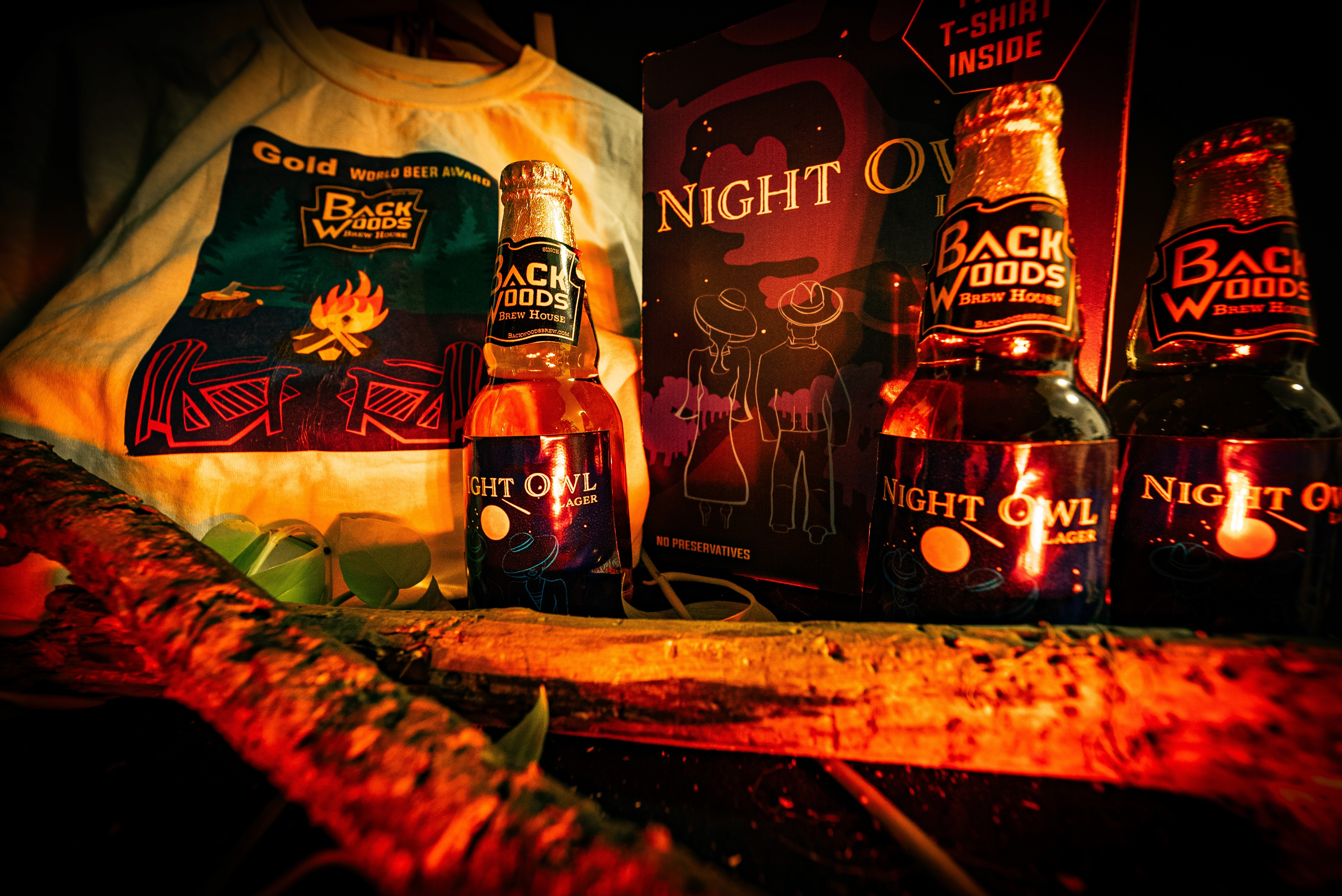
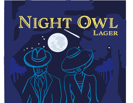
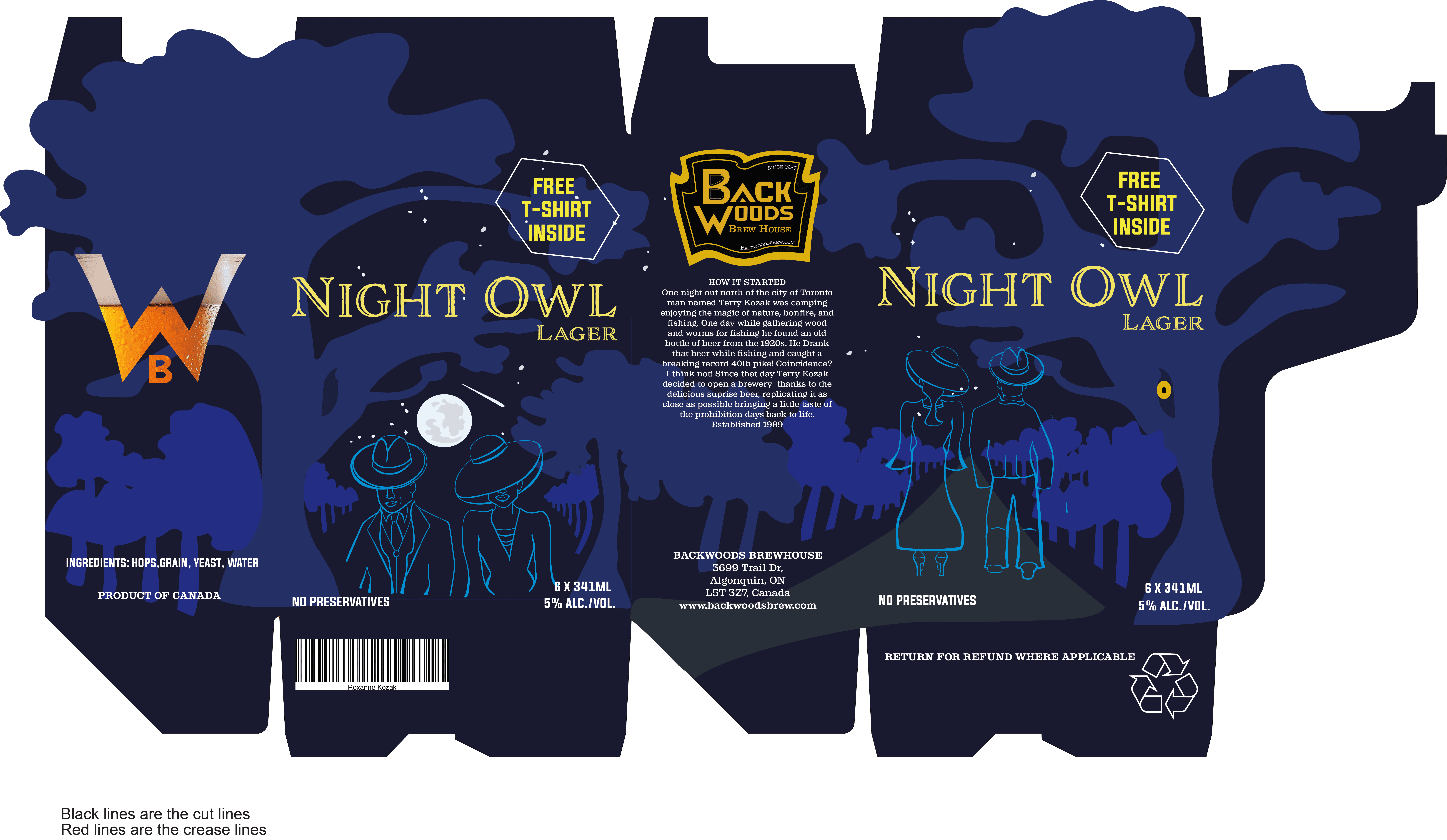
Backwoods Brewery was created with a focus on storytelling—bringing the journey, craftsmanship, and character behind the beer to life through design. We developed the label and six-bottle case packaging to share the brand’s origin story, blending a 1920s Prohibition-inspired aesthetic with a modern, refined edge.
From custom illustrated graphics and promotional merchandise to product photography and visual direction, every element was thoughtfully crafted to reflect the rugged, authentic spirit of the brand. Through strategic packaging design and art direction, we created a cohesive experience that captured the craftsmanship behind every bottle and gave the brand a story worth sharing.
Project Focus
Brand Strategy • Brand Identity • Packaging Design • Illustration • Merchandise Design • Product Photography • Art Direction


Custom Card Collection Rooted in Culture and Craft
This custom 52-card deck was created as a unique blend of illustration, storytelling, and functional design. Beginning with hand-drawn sketches, each card was carefully developed into a fully vectorized design in Illustrator from the numbered cards to the King, Queen, Jack, and Ace ensuring every piece had its own distinct personality while remaining clear and playable.
Inspired by tropical tribal aesthetics, the deck combines vibrant colour, intricate patterns, and bold visual elements to create a collectible experience unlike any traditional card set. Through detailed illustration, thoughtful design systems, and professional product photography, the final collection showcased the craftsmanship and creativity behind every card.
Project Focus
Concept Development • Illustration • Vector Design • Pattern Design • Product Design • Art Direction • Product Photography


Gaming Machine Sign
Designing a Bold Identity Where Adventure Meets Entertainment
Sir Campbell was developed as a memorable gaming brand identity inspired by strength, character, and adventure. Through a detailed brand discovery process, we created a bold knight-inspired logo that captured the perfect balance between heroic storytelling and the playful energy of the gaming experience.
The custom character design was extended across branded touchpoints, including custom mouse pads, creating a consistent and engaging visual presence that strengthened the connection between the brand and its audience.
Through strategic identity design, illustration, and art direction, Sir Campbell became a recognizable gaming persona built to stand out in a competitive entertainment space.
Project Focus
Brand Strategy • Brand Identity • Logo Design • Character Design • Merchandise Design • Illustration • Art Direction

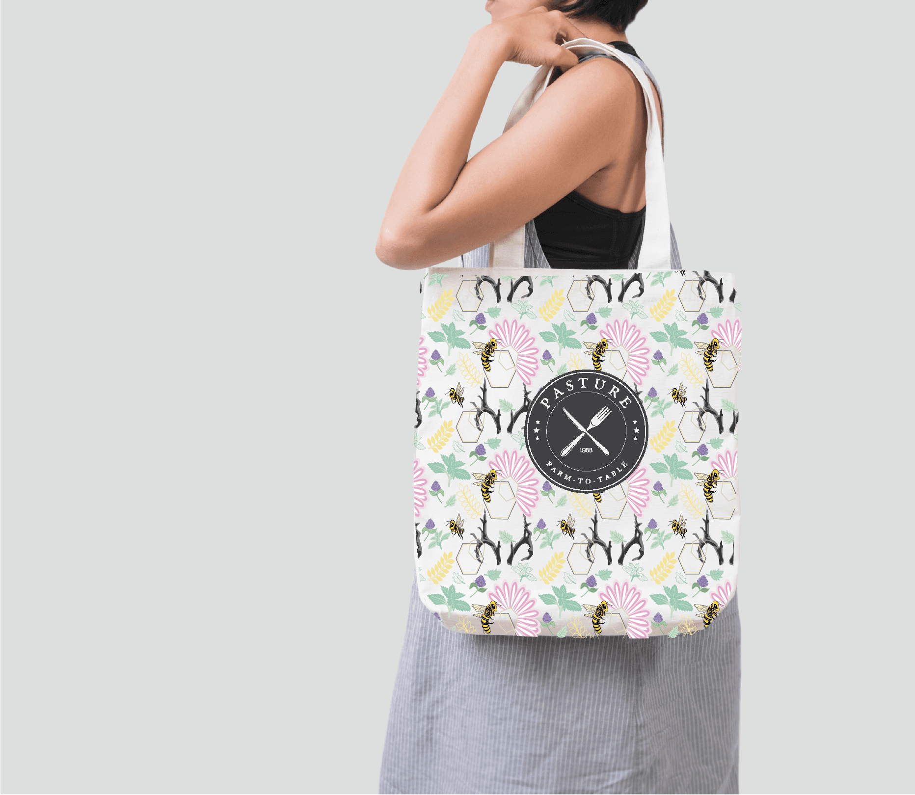
Creating a Signature Pattern That Brought a Farm-to-Table Story to Life
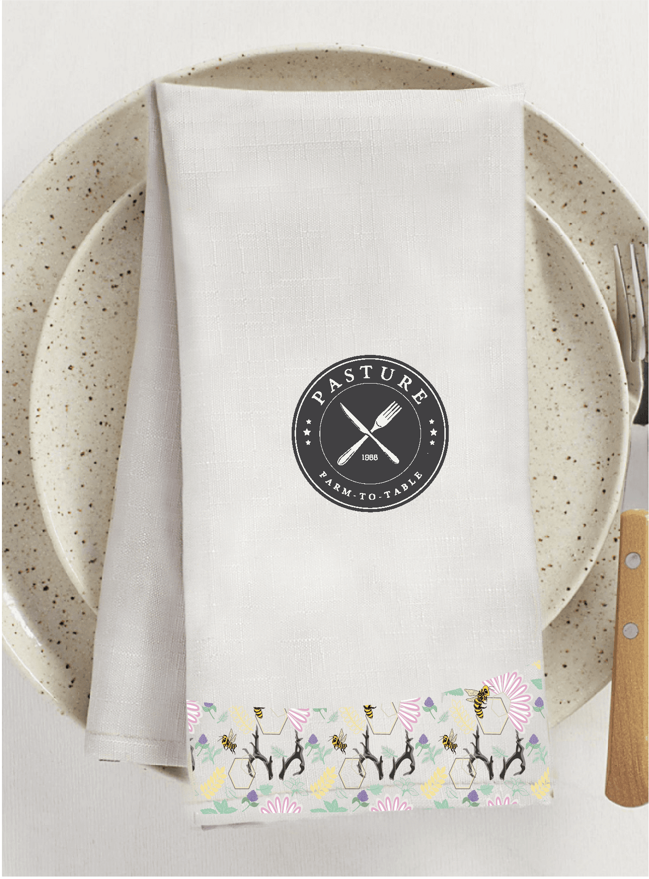
This farm-to-table restaurant transformation was inspired by the desire to create a warm, welcoming space that blended rustic charm with a modern, elevated feel. We developed a custom brand pattern designed to capture the essence of the restaurant’s earthy roots while creating a memorable visual identity guests could instantly recognize.
The pattern was thoughtfully adapted across multiple touchpoints, including feature wallpaper, reusable napkins, apparel, tote bags, and packaging creating a cohesive experience that extended beyond the dining space.
Through strategic pattern design and art direction, we helped transform the restaurant environment into a true reflection of its values: authentic, handcrafted, and connected to nature.
Project Focus
Brand Strategy • Brand Identity • Pattern Design • Environmental Design • Packaging Design • Print Design • Art Direction


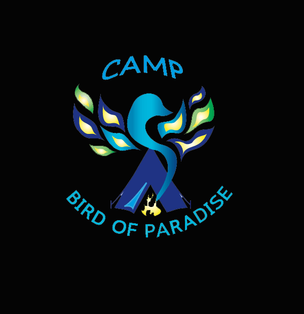
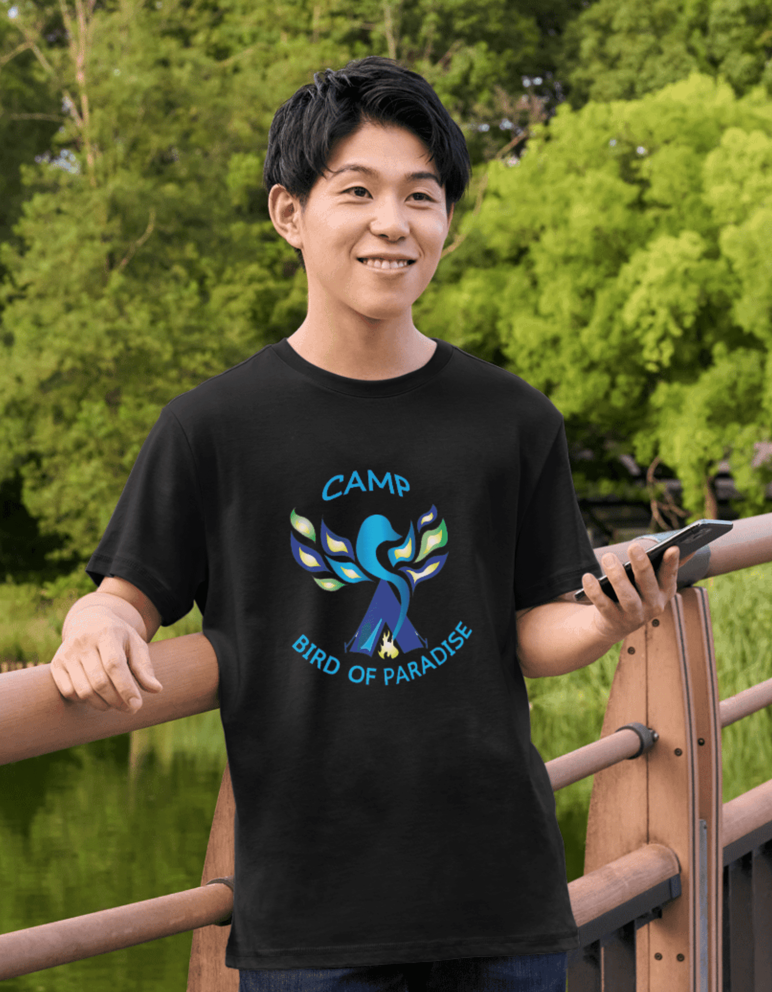
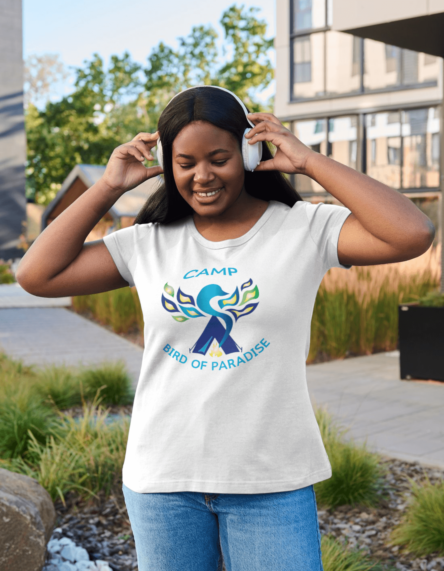
Logo For Burning Man Vehicle and merchandise
A Symbol of Freedom, Creativity, and Community
Created for a Burning Man-inspired art vehicle and merchandise collection, Bird of Paradise was designed to capture the energy, creativity, and free-spirited expression behind a festival built on music, art, and connection.
The challenge was to create a bold visual identity that would stand out on a dark vehicle while reflecting the vibrant atmosphere of a three-day celebration filled with immersive art, community, and self-expression. Through thoughtful logo design and merchandise development, the brand came to life as a symbol of movement, imagination, and adventure.
This project explored the power of design to represent a culture, inspire connection, and transform a simple vehicle into a recognizable creative experience.
Project Focus
Concept Development • Logo Design • Brand Identity • Merchandise Design • Illustration • Art Direction





Branding & Packaging
Storytelling Through Design, Timeless Logos, Labels, Brand Identity, Grabbing Copy & Voice, Custom Graphics & Illustrations, Strategy that converts, Packaging that sells
Pixels at Work