© 2025 Rox & Pixels. All rights reserved.
Website Designed + Developed By Roxanne Kozak
© 2025 Rox & Pixels. All rights reserved.
Website Designed + Developed By Roxanne Kozak

Graphics, Visual Identity, Voice, Target Audience, Strategy, Custom Box Design, Labels
Branding & Packaging

Rebrand, Full Custom Website, Logo, Initial setup of socials, E-commerce
Websites

Motion Graphics, Menus, Paintings, Album Covers, Invitations, Posters
Mixed Media
Pixels at Work
Rebrand, Full Custom Website, Logo, Initial setup of socials
Websites
Book Design, Shopify, Marketing, Art direction, Layout, Merchandise, Branding
Mixed Media
Rebrand, Full Custom Website, Logo, Initial setup of socials, E-commerce
Websites
Motion Graphics, Menus, Paintings, Album Covers, Invitations, Posters
Mixed Media
Rebrand, Full Custom Website, Logo, Initial setup of socials, E-commerce
Websites
Graphics, Booklet, Content Strategy, Branding
Branding & Packaging
Graphics, Visual Identity, Voice, Target Audience, Strategy, Custom Box Design, Labels
Branding & Packaging
Pixels at Work
Motion Graphics, Menus, Paintings, Album Covers, Invitations, Posters
Mixed Media

Contact
(416)520-1205
roxanne@roxandpixels.com
Contact
(416)520-1205
roxanne@roxandpixels.com
Contact
(416)520-1205
roxanne@roxandpixels.com
Contact
(416)520-1205
roxanne@roxandpixels.com
Receipe Pages
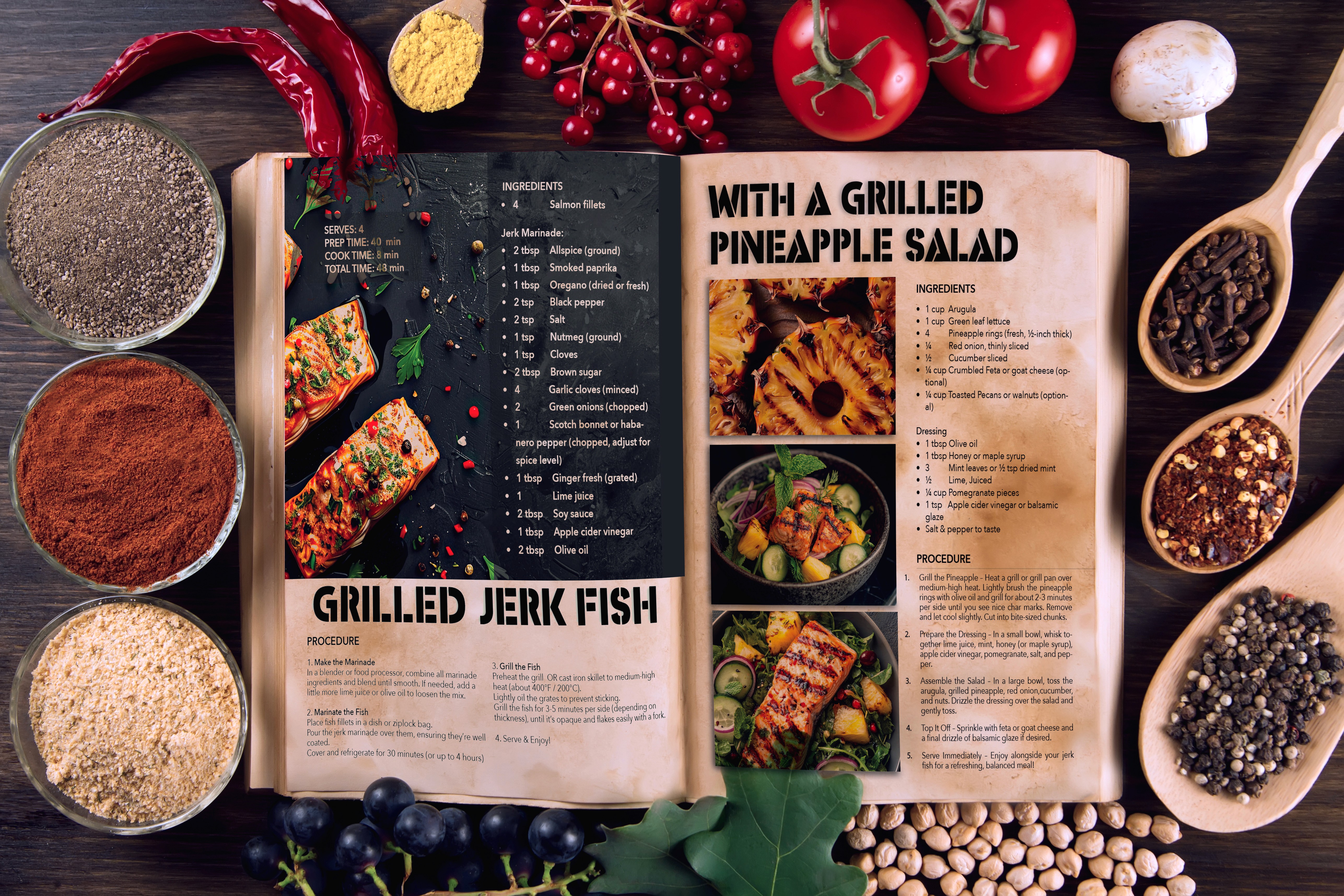
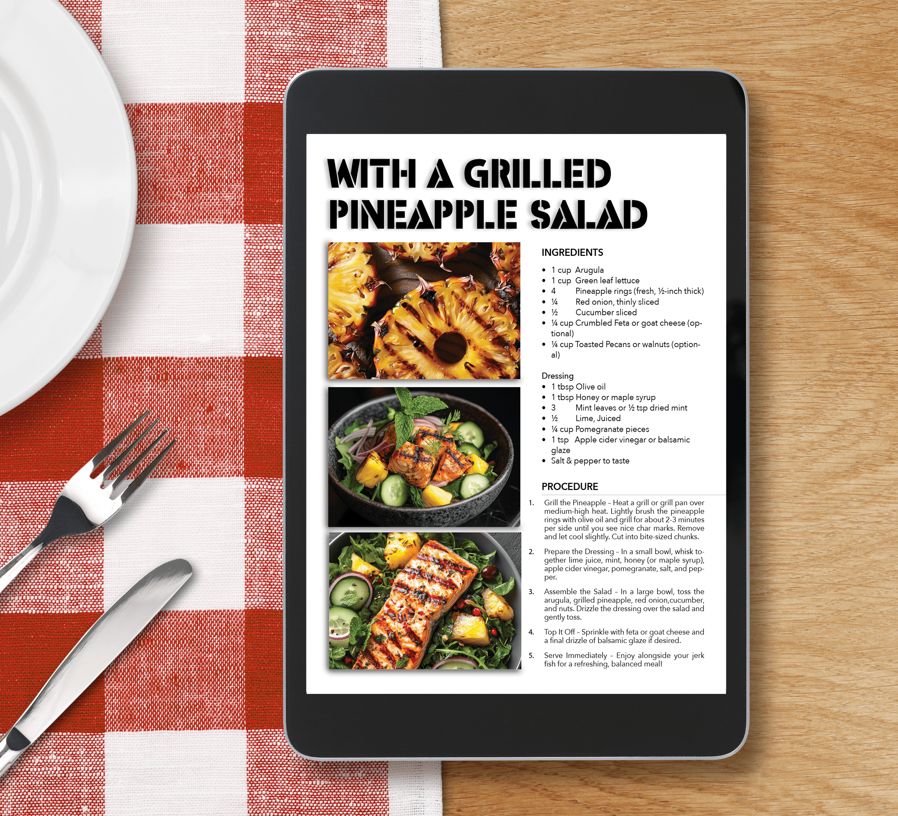
I carefully designed a recipe layout for a jerk fish and salad fusion, to be used for socials and web utilizing the Ten Magazine design Rules for Designers to create a clean, visually appealing format. This design makes it easy for readers to follow and recreate the flavorful dish that’s been gaining popularity online. With clear structure and eye-catching visuals, I ensure the recipe is both informative and engaging, making it a go-to for culinary enthusiasts looking to try something new.
Receipe Pages
I carefully designed a recipe layout for a jerk fish and salad fusion, to be used for socials and web utilizing the Ten Magazine design Rules for Designers to create a clean, visually appealing format. This design makes it easy for readers to follow and recreate the flavorful dish that’s been gaining popularity online. With clear structure and eye-catching visuals, I ensure the recipe is both informative and engaging, making it a go-to for culinary enthusiasts looking to try something new.

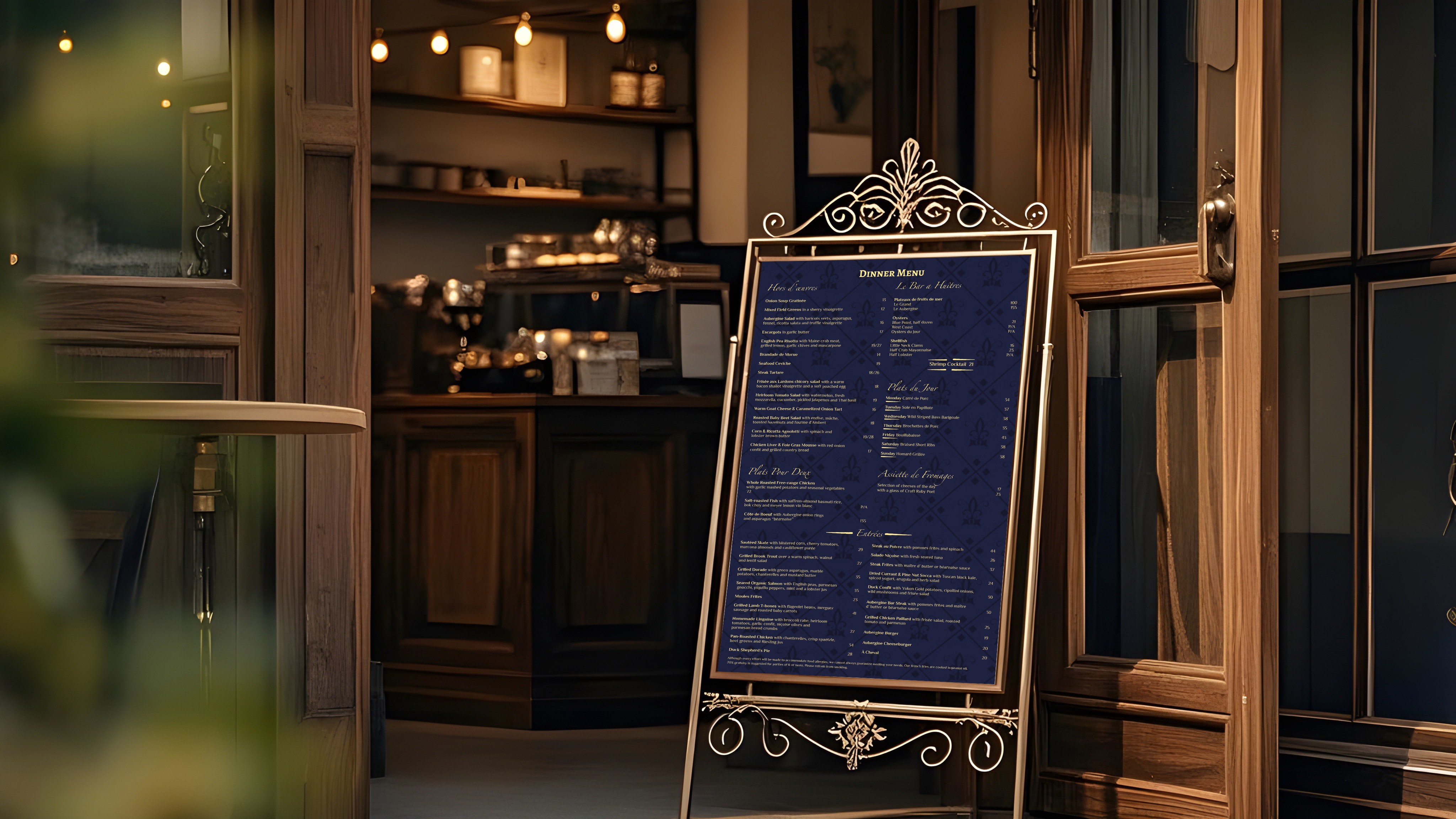
Fine Dinning French Restaurant Menu
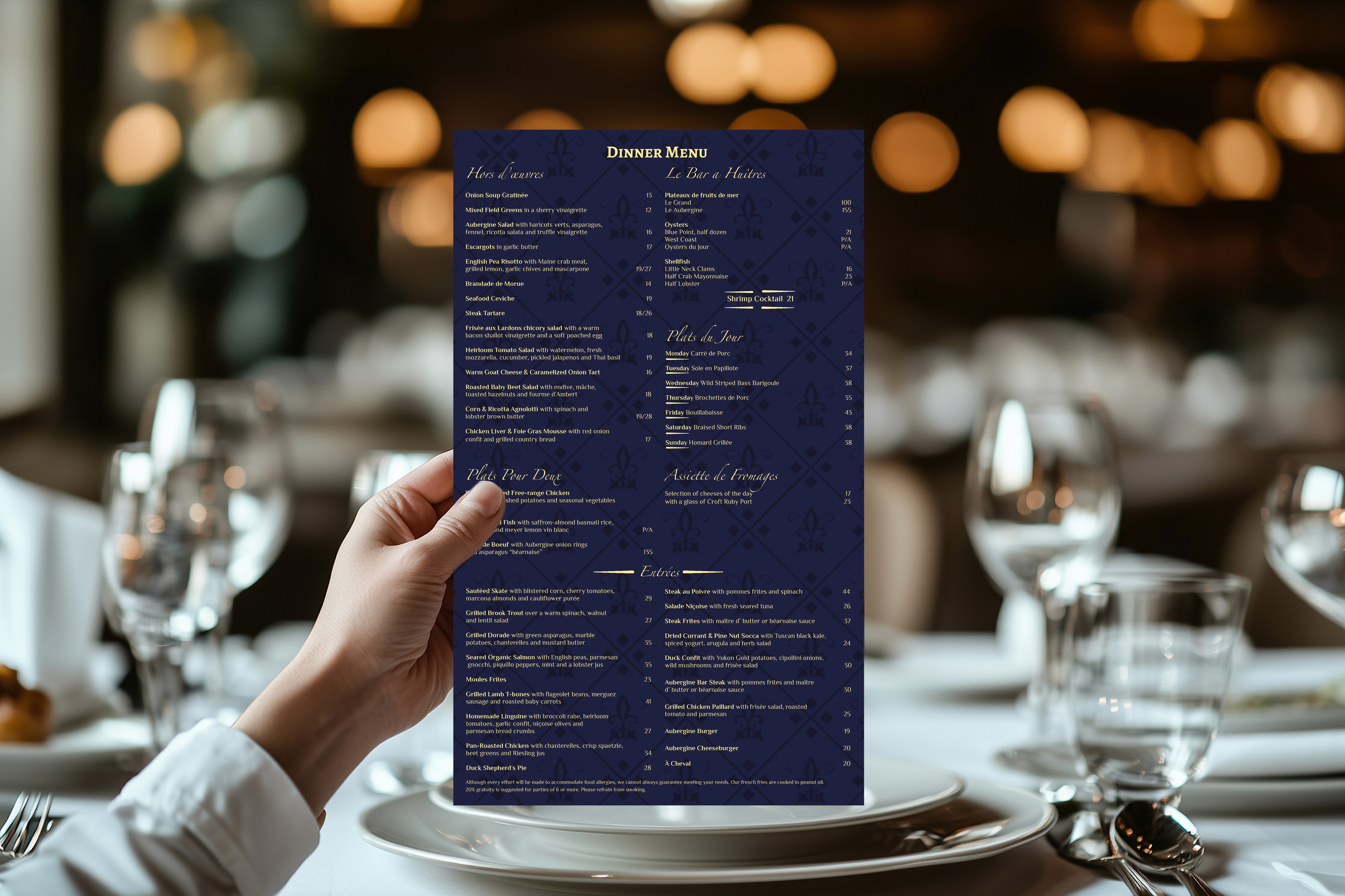
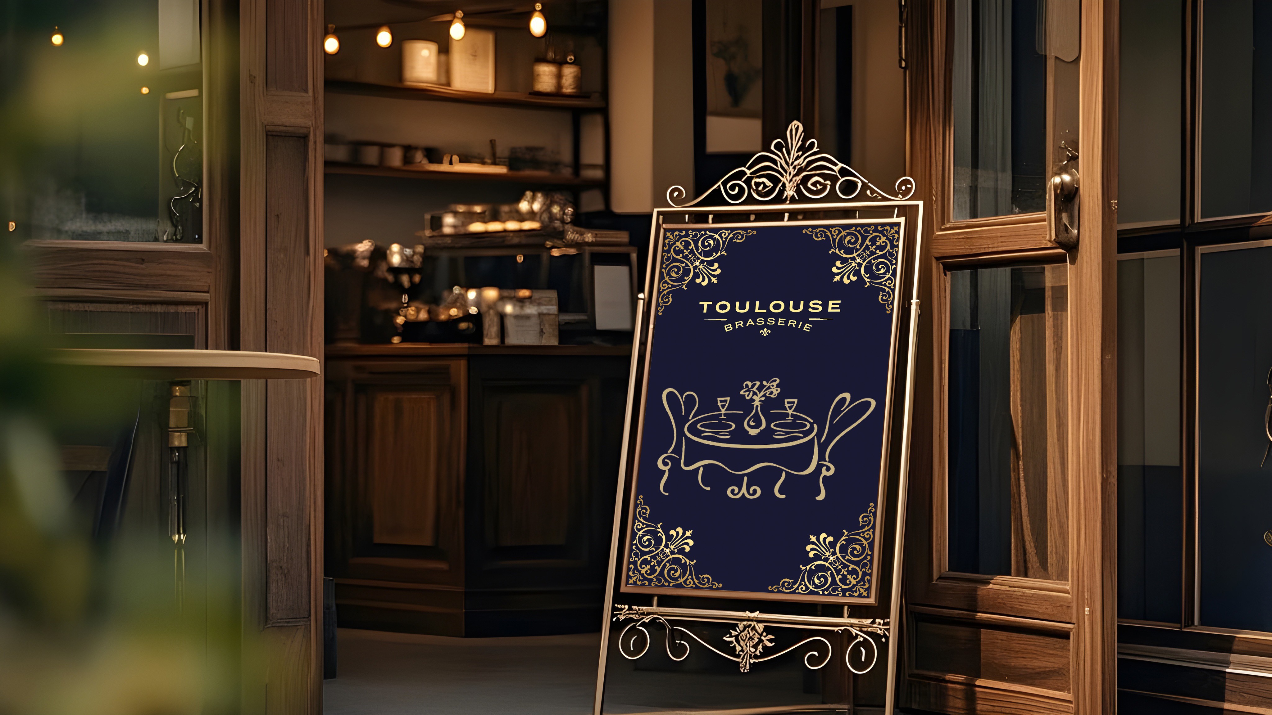
I had the pleasure of creating a fine dining French menu that captures the elegance and flirtiness of French culture, perfectly reflecting the mood of the establishment. Drawing inspiration from the idea that money is an endless river, I incorporated sophisticated typography and design elements that evoke a sense of luxury and refinement. A light French flag-inspired background pattern adds a subtle touch of national pride, while also giving the design the texture and depth that could easily be translated into a suede menu. The result is a menu that not only highlights the exquisite dishes but also immerses guests in a truly authentic and indulgent French dining experience.
Fine Dinning French Restaurant Menu
I had the pleasure of creating a fine dining French menu that captures the elegance and flirtiness of French culture, perfectly reflecting the mood of the establishment. Drawing inspiration from the idea that money is an endless river, I incorporated sophisticated typography and design elements that evoke a sense of luxury and refinement. A light French flag-inspired background pattern adds a subtle touch of national pride, while also giving the design the texture and depth that could easily be translated into a suede menu. The result is a menu that not only highlights the exquisite dishes but also immerses guests in a truly authentic and indulgent French dining experience.
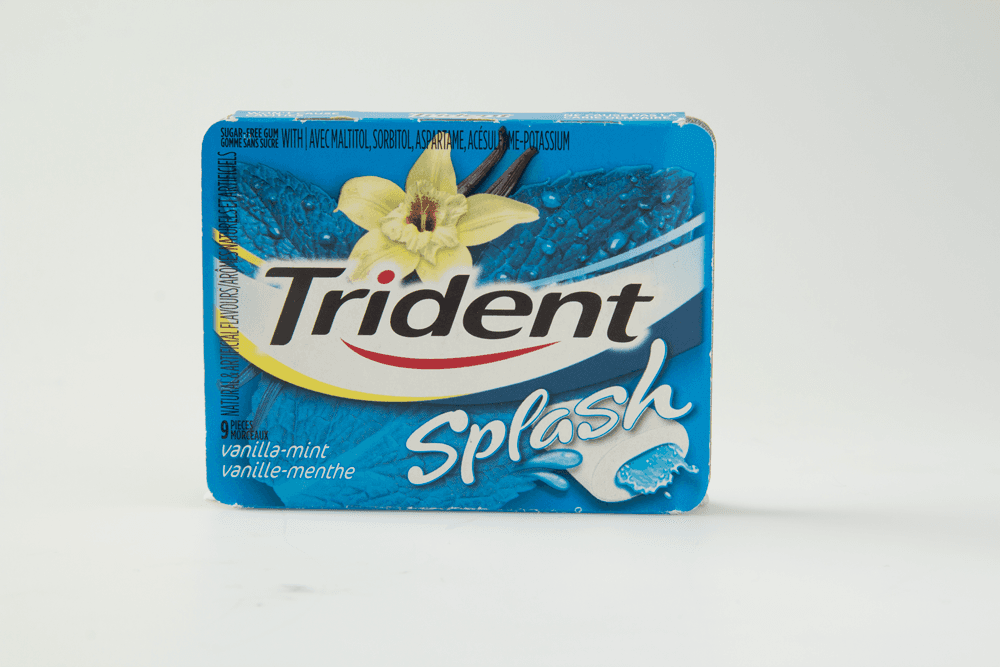
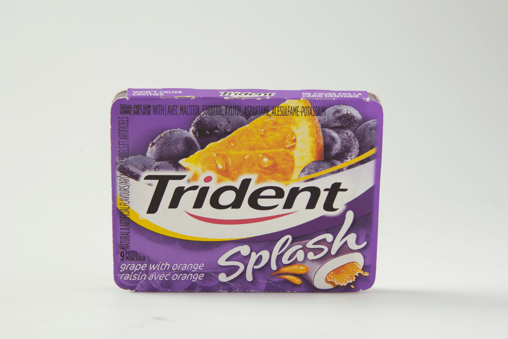
Gum Magazine Ad with Coupons
Had the opportunity to photograph Trident gum packs using a Canon DSLR, capturing them in RAW to ensure maximum detail and clarity. I then took these unedited shots and brought them to life in Photoshop, creating a dynamic magazine ad featuring coupons and stunning water splash effects. The final design emphasizes the freshness and vibrancy of the product, with the water effects adding a sense of energy and excitement to the ad. The result is a visually striking and engaging piece that captures the essence of the brand.


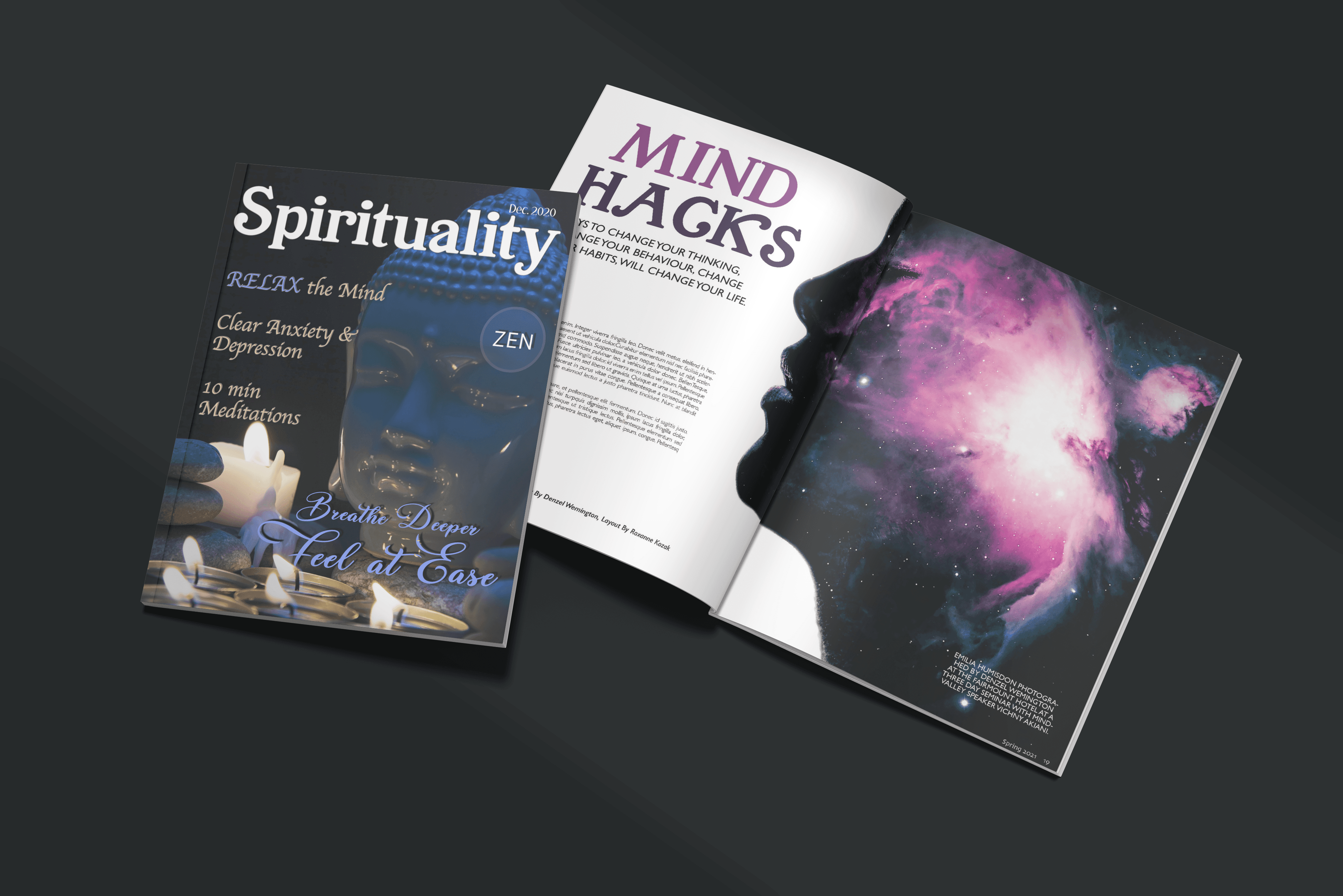
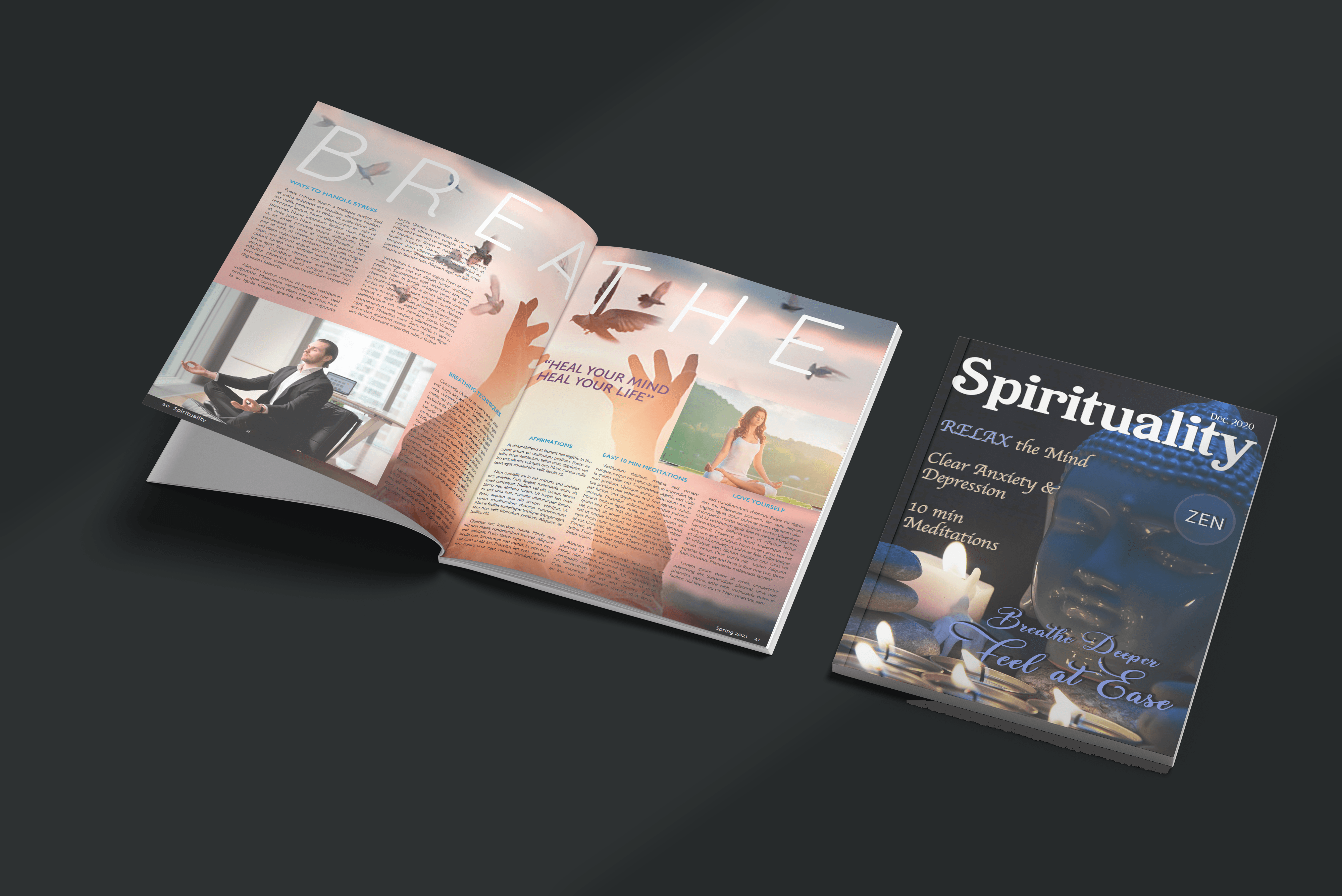
Magazine Cover & Spread
Designed the overall look and feel of a four-page magazine spread on spirituality, starting with shooting objects for the cover using a Canon DSLR in RAW for maximum detail and clarity. After capturing the images, I carefully edited them to bring out their full potential, ensuring a polished and professional appearance. One key example is the Buddha shot, where I transformed a before-and-after RAW image into a visually stunning final product that captures a relaxed, zen feel. The interior layout was meticulously designed to create an engaging and balanced flow, enhancing the reader's experience and deepening their connection to the content.


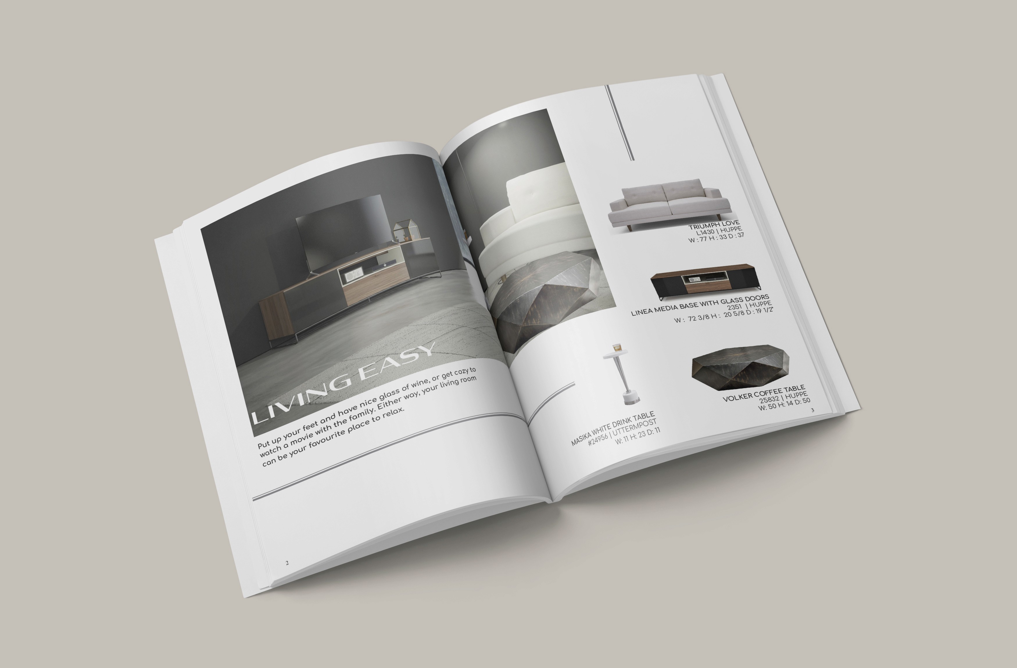
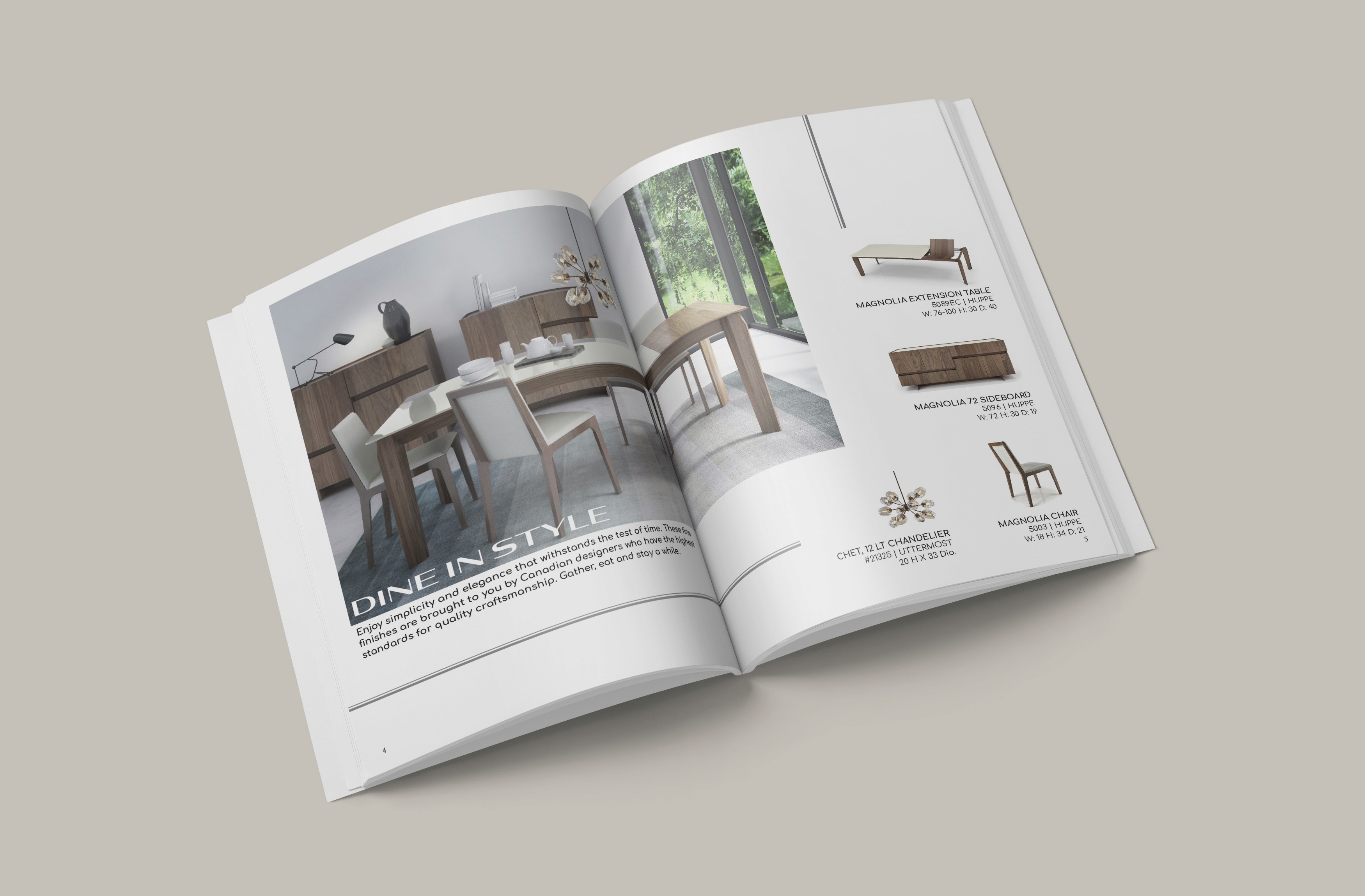
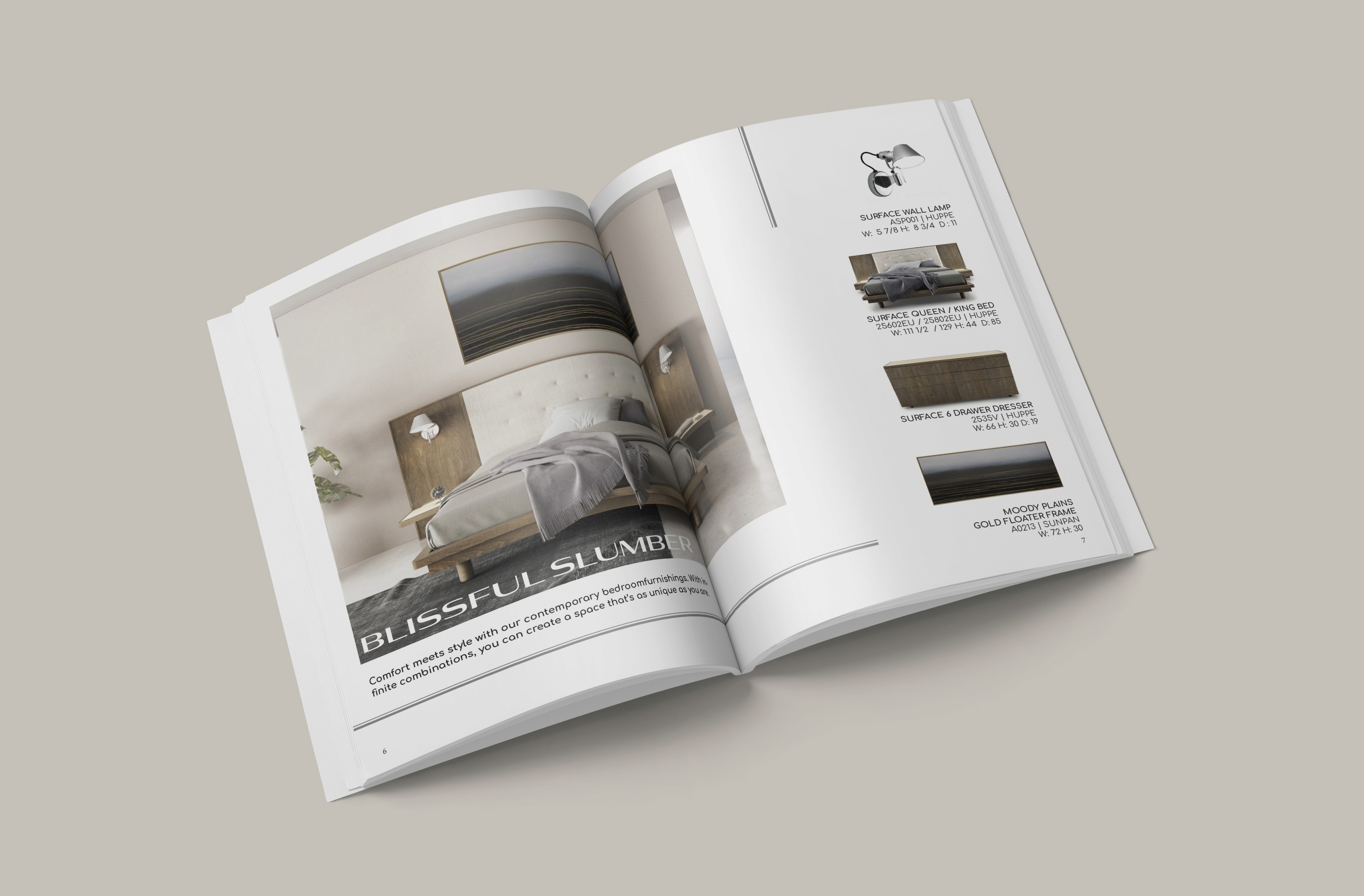
UP Country Catalogue Book
I had the opportunity to design a six-page catalog with a cover and back for a client to showcase their extensive warehouse inventory in a visually appealing and organized format. The catalog was crafted to highlight a curated selection of items in a concise, easy-to-navigate eight-page booklet, providing potential buyers with a clear overview of available products. Through strategic layout design, engaging visuals, and clean typography, I ensured that the catalog effectively captured the client’s brand while driving interest and boosting sales.
UP Country Catalogue Book
I had the opportunity to design a six-page catalog with a cover and back for a client to showcase their extensive warehouse inventory in a visually appealing and organized format. The catalog was crafted to highlight a curated selection of items in a concise, easy-to-navigate eight-page booklet, providing potential buyers with a clear overview of available products. Through strategic layout design, engaging visuals, and clean typography, I ensured that the catalog effectively captured the client’s brand while driving interest and boosting sales.


Catalogues, Booklets, Poster, Flyers, Copywriting, Content Strategy, Book Design, Photo Editing, Custom Sticker Graphics
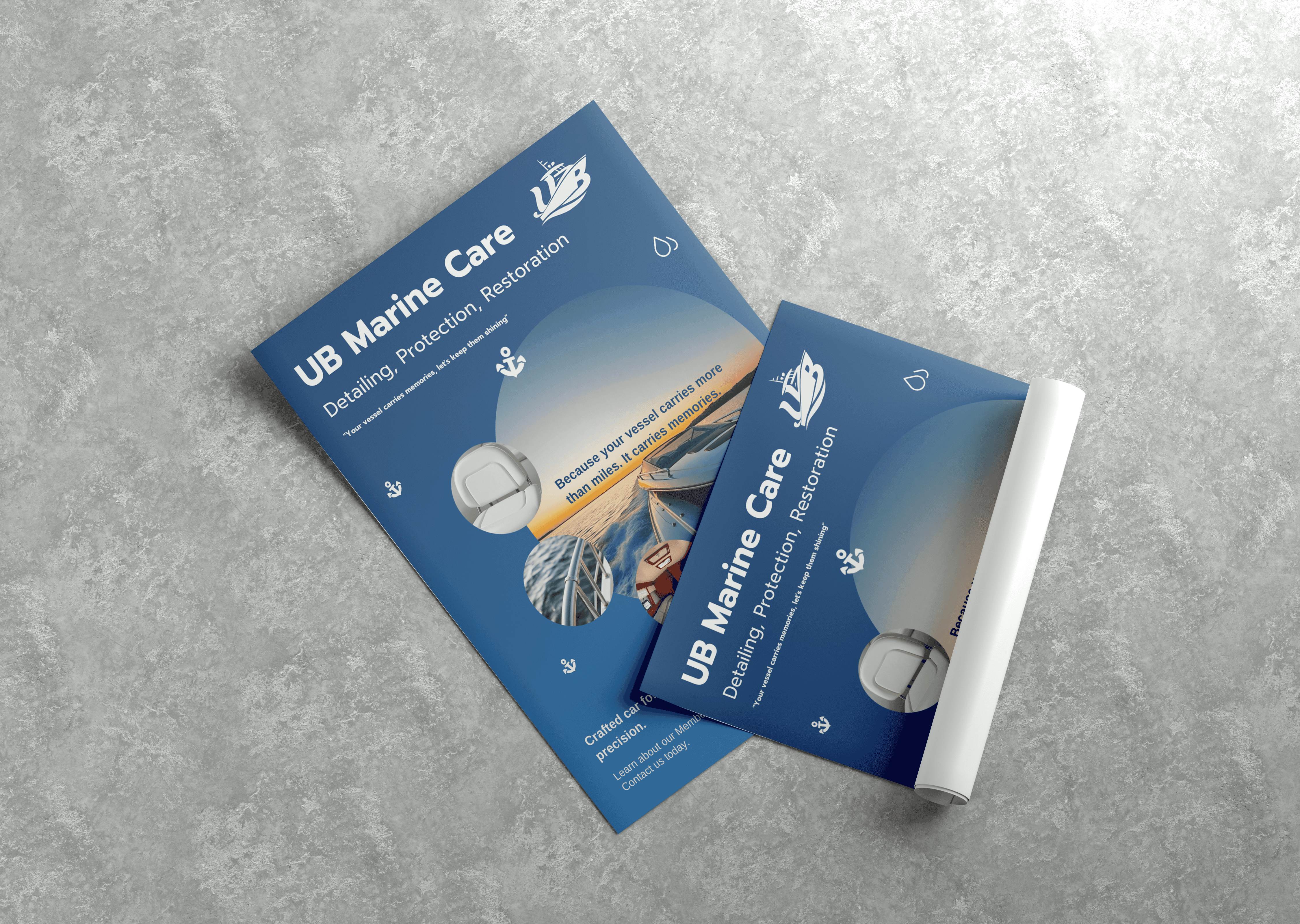
UB Marine Care
UB Marine Care restores and protects boats, bringing faded, oxidized hulls back to a mirror finish. Their brand needed the same level of polish. I rebuilt their identity from the logo up and created print and digital materials to present their services to boat owners and business partners.
What I Delivered
Logo redesign: The logo rebuilt as a clean, scalable vector, plus a standalone wordmark and brand graphic, each in the brand colours.
Brand guide: Rules for logo usage, colour palette and typography, so the brand stays consistent everywhere it appears.
Brochure: Their restoration, protection and membership services and their partnership programs, shown with professionally edited images.
Flyer: A promotional piece to put UB Marine Care in front of boat owners.
Social media posts: Branded posts that carry the new identity online.
The Result
UB Marine Care now has a unified brand that matches the quality of its work, looking established to boat owners and credible to partners.
UB Marine Care
UB Marine Care restores and protects boats, bringing faded, oxidized hulls back to a mirror finish. Their brand needed the same level of polish. I rebuilt their identity from the logo up and created print and digital materials to present their services to boat owners and business partners.
What I Delivered
Logo redesign: The logo rebuilt as a clean, scalable vector, plus a standalone wordmark and brand graphic, each in the brand colours.
Brand guide: Rules for logo usage, colour palette and typography, so the brand stays consistent everywhere it appears.
Brochure: Their restoration, protection and membership services and their partnership programs, shown with professionally edited images.
Flyer: A promotional piece to put UB Marine Care in front of boat owners.
Social media posts: Branded posts that carry the new identity online.
The Result
UB Marine Care now has a unified brand that matches the quality of its work, looking established to boat owners and credible to partners.



© 2025 Rox & Pixels. All rights reserved.
Website Designed + Developed By Roxanne Kozak
© 2025 Rox & Pixels. All rights reserved.
Website Designed + Developed By Roxanne Kozak
Magazine Cover & Spread
Designed the overall look and feel of a four-page magazine spread on spirituality, starting with shooting objects for the cover using a Canon DSLR in RAW for maximum detail and clarity. After capturing the images, I carefully edited them to bring out their full potential, ensuring a polished and professional appearance. One key example is the Buddha shot, where I transformed a before-and-after RAW image into a visually stunning final product that captures a relaxed, zen feel. The interior layout was meticulously designed to create an engaging and balanced flow, enhancing the reader's experience and deepening their connection to the content.
© 2025 Rox & Pixels. All rights reserved.
Website Designed + Developed By Roxanne Kozak
Magazine Cover & Spread
Designed the overall look and feel of a four-page magazine spread on spirituality, starting with shooting objects for the cover using a Canon DSLR in RAW for maximum detail and clarity. After capturing the images, I carefully edited them to bring out their full potential, ensuring a polished and professional appearance. One key example is the Buddha shot, where I transformed a before-and-after RAW image into a visually stunning final product that captures a relaxed, zen feel. The interior layout was meticulously designed to create an engaging and balanced flow, enhancing the reader's experience and deepening their connection to the content.
UB Marine Care
UB Marine Care restores and protects boats, bringing faded, oxidized hulls back to a mirror finish. Their brand needed the same level of polish. I rebuilt their identity from the logo up and created print and digital materials to present their services to boat owners and business partners.
What I Delivered
Logo redesign: The logo rebuilt as a clean, scalable vector, plus a standalone wordmark and brand graphic, each in the brand colours.
Brand guide: Rules for logo usage, colour palette and typography, so the brand stays consistent everywhere it appears.
Brochure: Their restoration, protection and membership services and their partnership programs, shown with professionally edited images.
Flyer: A promotional piece to put UB Marine Care in front of boat owners.
Social media posts: Branded posts that carry the new identity online.
The Result
UB Marine Care now has a unified brand that matches the quality of its work, looking established to boat owners and credible to partners.
© 2025 Rox & Pixels. All rights reserved.
Website Designed + Devloped By
Roxanne Kozak
© 2025 Rox & Pixels. All rights reserved.
Website Designed + Devloped By
Roxanne Kozak